Kernel Wealth is a New Zealand-based investment platform that aims to help Kiwis cultivate long-term wealth. Kernel Wealth tasked Edition to redesign their website to incorporate their new branding (done by Anna Hughs), as well as introduce the new KiwiSaver and savings offerings. I was part of a team that consisted of myself, a senior product designer (Nick) and a design lead (Jodie) from Edition, as well as a head of product (Armin), a marketing manager (Catherine), and a team of developers from Kernel.
Initial Discovery
User Research
Information Architecture
User Journey
UX/UI Design

As a product designer, delving into the world of index funds investing was a fascinating learning journey. During the discovery phase, my responsibilities included competitor analysis, as well as note-taking for user interviews with current Kernel customers. The insights helped us understand customer motivations when choosing Kernel, as well as the pain points we needed to address during the redesign.
"I was tossing between Kernel and InvestNow, but ultimately Kernel’s financial literacy resources helped convince me to go with them.
- Kernel Investor, 31"
"I was new to investing and had lots of questions regarding the product, I remember I found it hard to find the contact form link as it was hidden in the footer. After I sent the form it took quite a long time for a financial advisor to get back to me.
- Kernel Investor, 25"

To enhance the overall browsing experience and ensure content discoverability, we focused on restructuring the IA. Our primary objective was to optimize the 'Invest' dropdown, which served as a foundation for informing the 'Save' and 'KiwiSaver' sections.
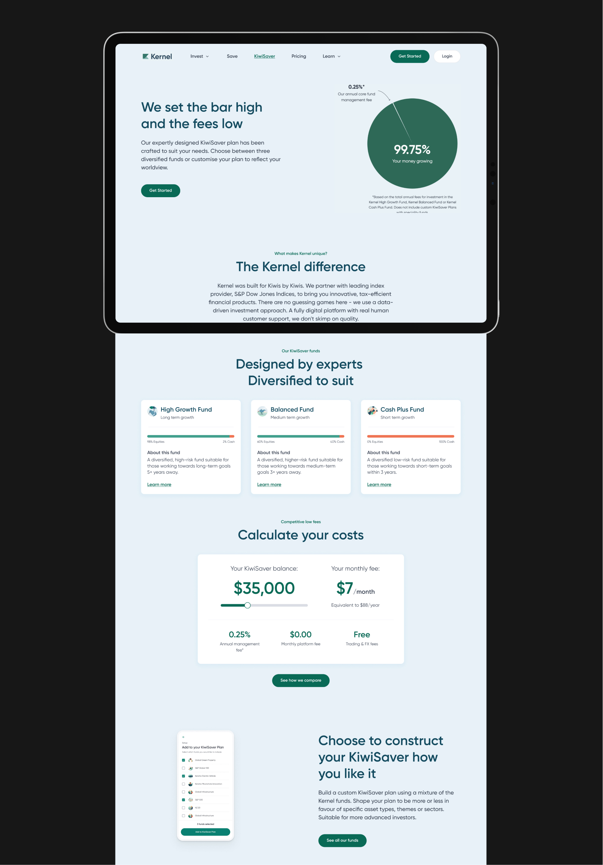
Recognizing the importance of the interactive calculator as a persuasive tool for attracting new customers, we elevated its prominence from a tertiary level to a secondary level within the IA. Furthermore, with the expansion of fund options from 3 to 17, we streamlined the navigation by consolidating individual fund pages under a more cohesive 'our funds' section, improving overall browsability.

As part of my responsibilities, I was assigned to develop the interactive calculator for the investment page. To begin, I studied Best Practice examples, which provided valuable guidance and inspiration for the direction I should take. Armed with the required information, I proceeded to incorporate the necessary components into the calculator to ensure its functionality and relevance.

Based on Kernel's internet traffic data, we discovered that nearly 75% of visitors access the marketing website through mobile devices. To cater to this mobile audience, we made the decision to implement a floating hamburger menu button. Despite it deviating from the traditional pattern, extensive testing revealed that customers found it more convenient to access with their thumbs, ensuring a smoother and more user-friendly browsing experience.